


A jury of four leading European graphical designers and of four organic experts, as well as the former bicycle racer Miguel Indurain, selected ten logos from several thousand submission by young graphical designers and design students. The criteria for the selection were clearly defined, e.g. they should give the message of organic agriculture and of EU origin in a picture, not in words; the logo should be easily recognisable, have high quality graphical design elements and should be applicable in different colours and sizes on food labels. The young designer contest started in May 2009, the jury selected in July 2009.
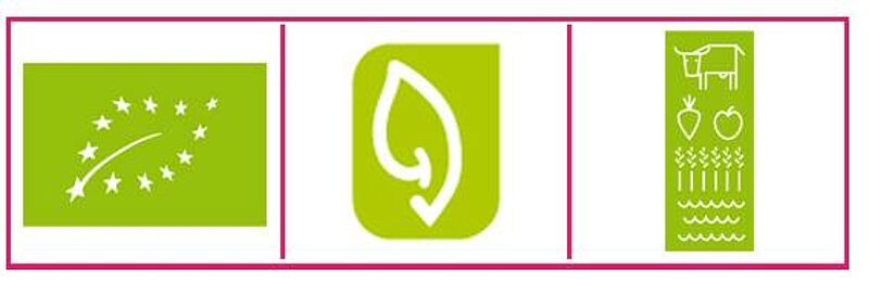
After legal, administrative and other investigations, the European Commission selected, from the 10 proposals selected by the jury, the three above mentioned logos for a public internet vote which is open now till the end of January 2010.
It did not come much as a surprise that once published, the three proposals aroused a lot of criticism. I do not share most of this criticism, and I would like to define my position.
The first logo proposed by the Commission shows the EU stars in the shape of a leaf. It is a very straightforward sign containing two clear messages: Nature and Europe. The graphical design is soft-footed and elegant. With the supplement of “organic”, “ökologisch”, „biologique“, „økologisk“, it will be a very good and visible European organic logo. It is also important to note the ancillary word-mark is very important as there is no picture or pictogram which can deliver the information “organic” by itself.
A further advantage of the first proposal is that it is not a dominant one, it is low profile in a gentle way. Therefore, it won’t compete with attractive private, regional or national logos, but it will add a congenial “green European element”.
The only criticism which could be brought forward is that this logo might be a bit too classical and might therefore not fully appeal to young consumers. An audaciously designed ancillary word-mark with the message “organic” might improve that weakness.
The second logo proposed by the Commission is an amalgam between a leaf and an ear. In addition, it connotes germination: the leaf shape sprouts out of a lengthy seed. And finally, it shows a check sign at the bottom like the German organic logo. This second proposal is extremely dense in information. It shows the different dimension of organic agriculture: nature and human interactions as a metaphor for “Farmers who listen to nature”. With the check sign it symbolises the organic certification.
The density of information of the second logo might have made the design a bit more clumsy than the one of the other two. Nonetheless, the simple and clear lines of this logo are catchy and will give a profile to it which can be easily remembered. Again this logo needs to be accompanied by a word-mark “organic”.
The third logo narrates the story of organic agriculture in a very precise way: integrating animals (dairy cow), apple, beetroot, cereals, grass, soil and water, all intrinsic elements of an organic system, positioned on a warm and harmonic green background. This logo fully meets the requirement of all those critics saying that a logo should contain the information “what is organic?”. Out of about 500 submitted logos that tell the story, this third logo was far the best. In addition, it was the only one which could be reduced to a certain degree.
The graphical design of the third logo is sensational! It realises the concept “reduce to the max” and appeals to young people and has a maverick shape. It tells a story like every good commercial. Contemporary design, with no hang-over to the pseudo-romantic design of 1968 generation, indeed.
Nonetheless, the third logo shows the limits of a sign which tells a story. Although it works in all colours and it can be shrunk in a considerable way, it takes its room on every label. Beyond 4 to 2 millimetres, it doesn’t work anymore.
All three logos which are proposed by the Commission are eligible. It is a very good range submitted to public voting by the Commission. Each of them has a real potential to become an EU-wide appreciated logo. It is now important to insist vis-à-vis the Commission, that the final logo has to be used with a word-mark “organic” in the respective national language.
Urs Niggli, 21 December 2009, 10:56 Uhr
More information
Contact
Urs Niggli, FiBL